
Web Developer Intern
June - August 2024
Figma, HTML, CSS, JavaScript, Git, Google Analytics, Heap, Statamic CMS
1 Designer & Developer (me)
1 Sr. Creative Marketing Manager
AdRoll is a B2B SaaS company that helps other businesses implement intentional advertising to help them meet their business goals. The company offers many resources outlining past and current marketing strategies and concepts that are public and free for everyone. However, it was difficult for businesses to navigate through the entire collection and efficiently find what they needed, which drove away interest in AdRoll.
How might we create a centralized space for resources to drive more traffic and interest in our advertising software?
Brought a new resources library to life from design to development.
This project is special to me because I was dipping my toes into something new—web development—along with UI design. I was given free rein over the execution of the project. So I said: “Challenge accepted.” Here’s how it went.

Good design is one that is usable, useful, and desirable. I spent two weeks trying to understand the root of the problem by scouring through 6 other advertising companies’ resources pages and analyzing user behavior through Google Analytics and Heap.

After identifying the common deflections of the webpage—where and why people are driven away—I jumped into the ideation phase. I worked on several iterations of a prototype, from a low fidelity to a fully-functional mockup.

This is where the real challenge began. With little to no knowledge on HTML, CSS, and JavaScript, I went forward and coded 4 responsive web pages, sifting through CMS to create a centralized, navigable resource center.
So who is visiting our site the most? AdRoll’s software is geared towards helping other businesses and personal brands with improving their advertising strategies. The main group of people visiting our website are organizations or individuals who have smaller businesses and are looking to get their brand out to the world. When they come to AdRoll, they look for two main things: advertising resources and 1-on-1 advertising solutions.
The centralization of the company's resources is in on the Resources Library page. I identified four main features on the resources page that harness the most engagement:

First point of engagement for site visitors, showcasing the most up-to-date and relevant AdRoll resources & guides.

Allows visitors to customize their experience with our website, by choosing topics and resource types of their choice.

Where visitors gain a very high level overview of select resources, where they can navigate to the resource’s main page to learn more.

Where users enter the conversion funnel to becoming possible customers for AdRoll by clicking to the pricing page.
For each of these features, I conducted thorough webpage analysis to identify pain points and derive key findings on what could be improved.
I had asked our team's Web Growth Marketing Manager for guidance on how to use Google Analytics 4 and Heap, a digital insights platform, to observe and quantify user behavior. The heatmaps and scroll activity below are derived from these analytics platforms.


Cursor hovers over featured article titles, namely the first two.
Featured resources should aim to be both inviting and informative, having a balance of visual organization and adequate textual content to attract site visitors.
The filter tool should conserve space while serving its functionality, minimizing the time it takes for visitors to reach the resources that best match their needs.


Site visitors’ attention may only stay up until the 1st scroll of the resource gallery, so it is important to display the most relevant and eye-catching resources at the top.
It is also important to include descriptive elements along with the resource so users can quickly scan through content before deciding to click into it.
Should be accessible throughout the page to maximize conversion and sign-up rates.

Based on the key takeaways for each of the important engagement features, I brainstormed ways to improve each of them in order to answer the problem statement: How might we create a centralized space for resources to drive more traffic and interest in our advertising software?
The basis to all designs is a good backbone structure, one that has been iterated on and recycled upon different ideas. I began designing the new interface by drawing versions of sketches that incorporated the brainstormed features above.


The basis to all designs is a good backbone structure, one that has been iterated on and recycled upon different ideas. I began designing the new interface by drawing versions of sketches that incorporated the brainstormed features above.

This was my first version of the revamped webpage prototype. The main focus here was organization and conciseness.
After checking in with my team and with my manager about the design, I received the following general pieces of feedback:
1) Color should not distract the user, but enhance their experience.
2) Simplicity is sometimes better than complex, functional components.
3) The layout of the cards was great in helping navigate users to various categories of resources.
4) Keep in mind the responsiveness to display size as the layout will look different on mobile device.
For my final version, I went for a more minimalistic look to give the website an overall lighter feeling. The emphasis was on the content, not the color.
Additionally, I took into account the responsiveness of the page and designed a layout for mobile devices, which I would reference to later when I use media queries in JavaScript to change displays.


The last 4 weeks of the project were dedicated to bringing the design to life through code. I was inexperienced in HTML, CSS, and JavaScript, and have never used any frameworks that build web applications. The learning curve was going to be steep but I was excited to try. From home to local coffee stores, I coded wherever I went.
There were certainly more times than not where I couldn't figure out how to develop a design. Many CSS styles that worked on other websites didn't work on mine because of the different structures I implemented. All in all, the best foot forward was one that didn't stop in its tracks. Stack Overflow became my best friend and the new design was being flushed out one Git push at a time.

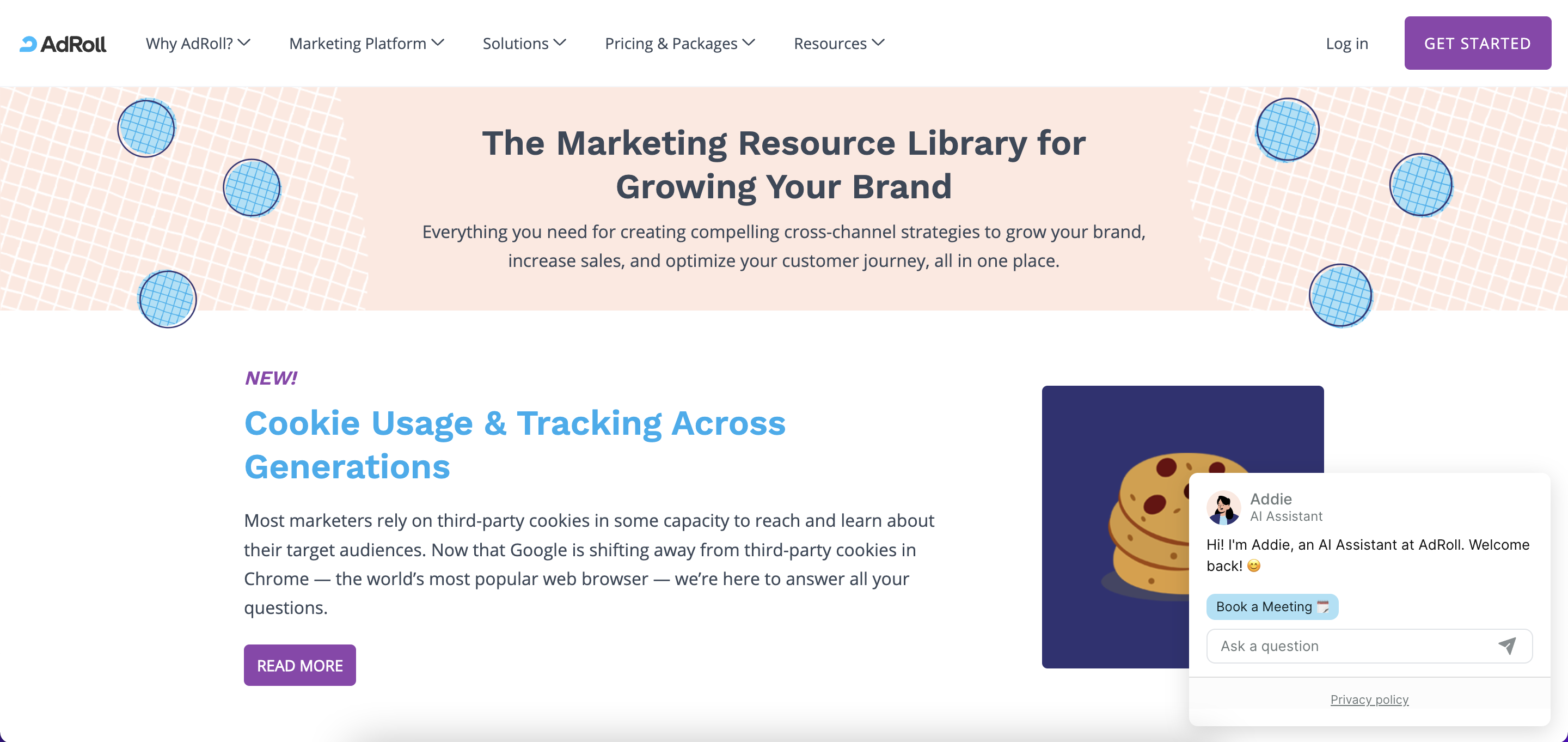
The final webpage is now live at www.adroll.com/resources!
I want to thank my manager for all of his guidance and patience with me tackling this project. I had the opportunity to learn web development tools, and how to critique and receive critique on designs. The process of learning was so addictive that I wish the project could have been longer than the 9 weeks I had.